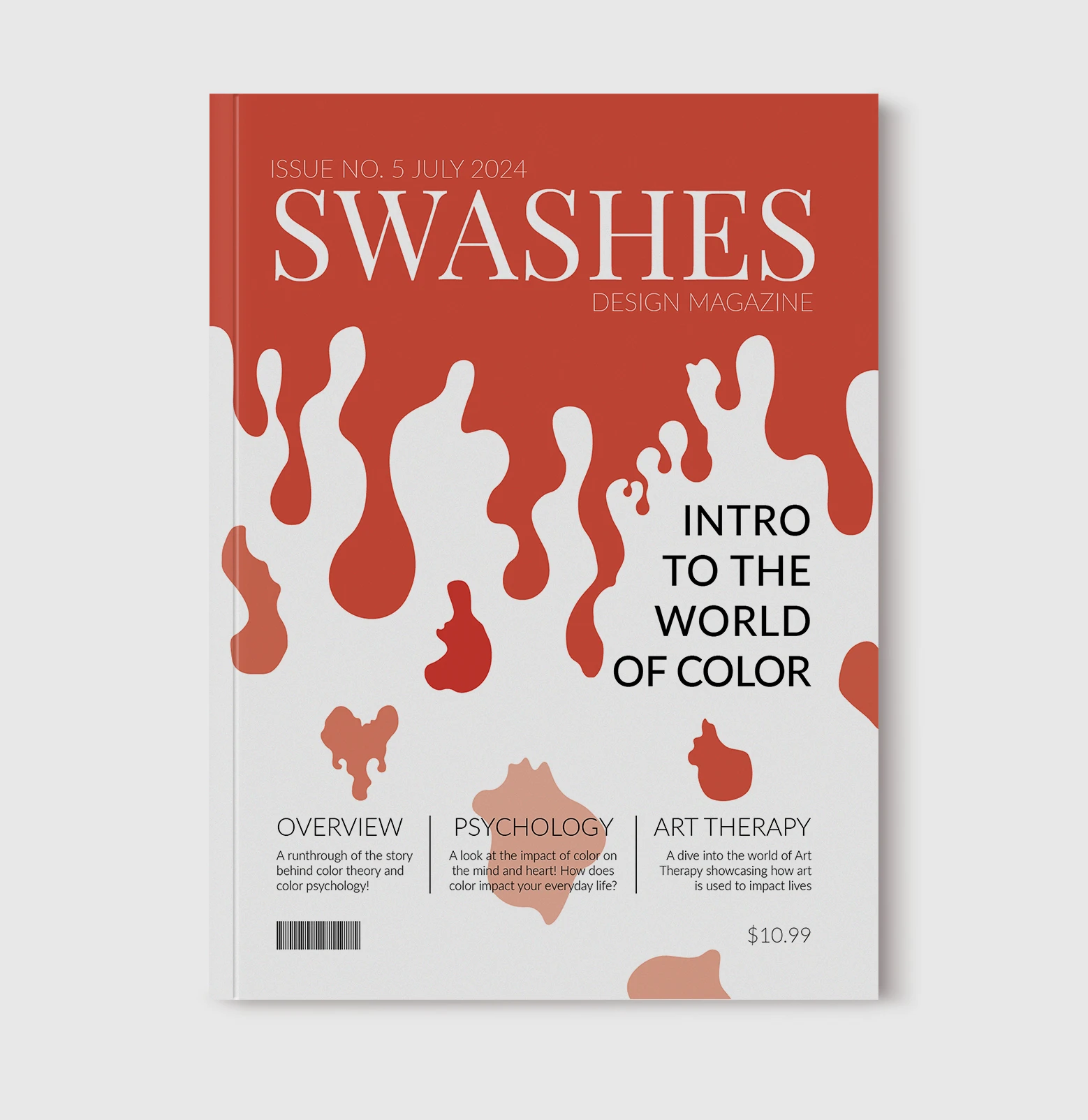
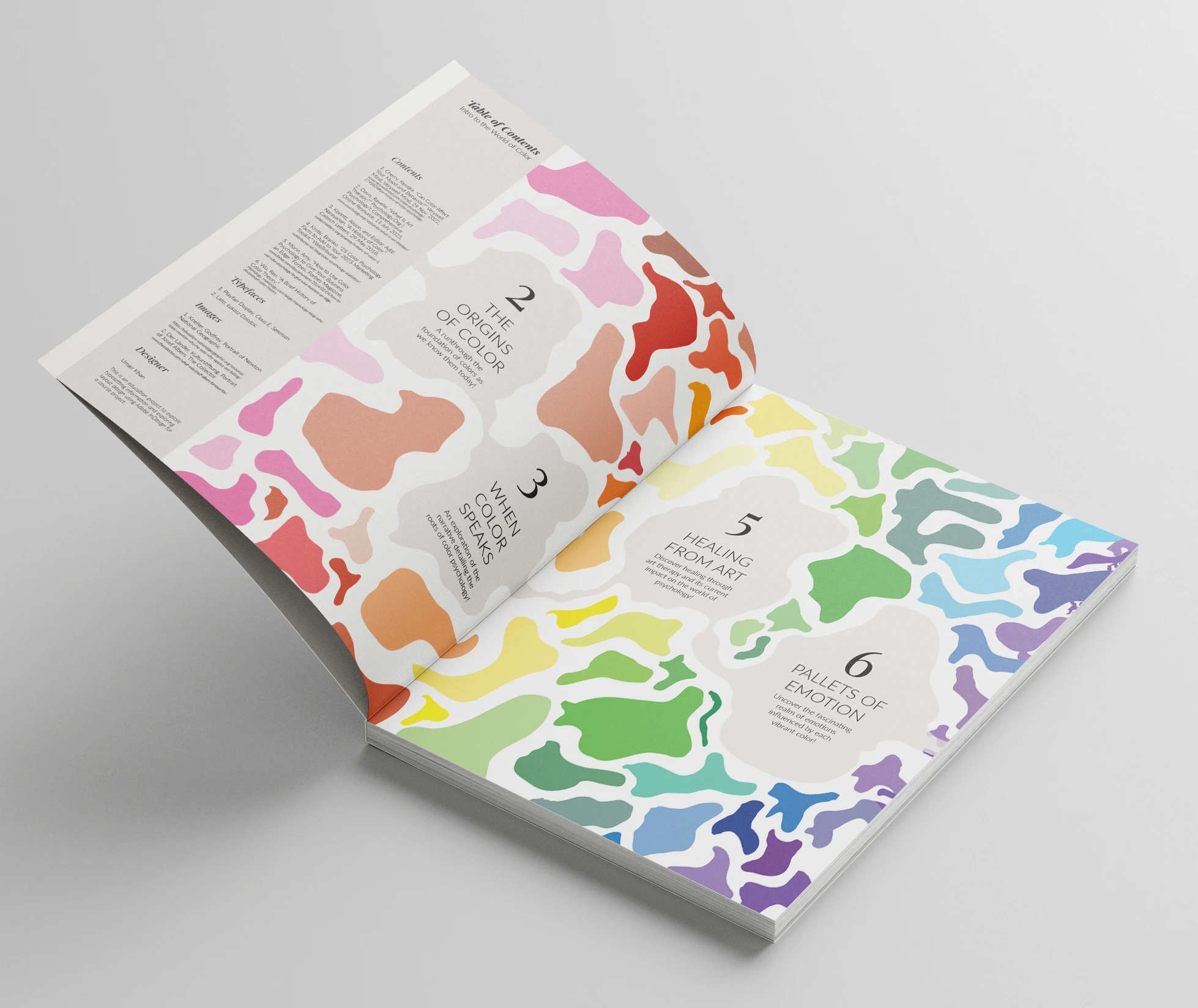
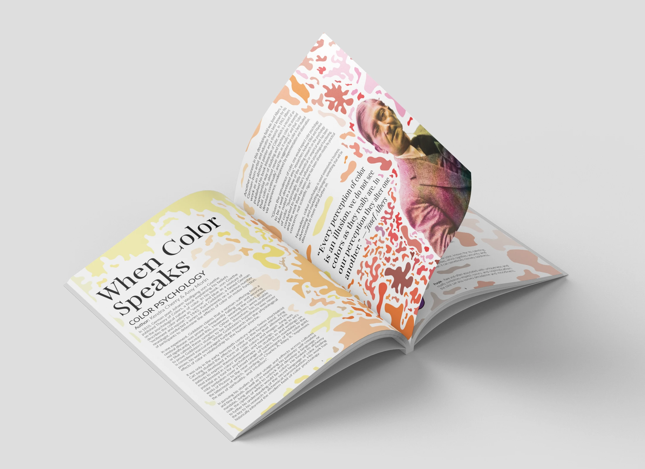
This issue of Swashes magazine, titled "Intro to the World of Color," offers a comprehensive exploration of color theory, history, and psychology. The design is visually striking, utilizing bold colors and organic shapes to reflect the theme. The magazine features a range of articles, including a deep dive into the origins of color, an analysis of the language of color, and an exploration of the healing power of art therapy. The design elements work together to create a visually engaging and informative reading experience.
I aimed to create a visually engaging and informative magazine that would captivate readers and immerse them in the world of color. I chose a bold and dynamic color palette, incorporating vibrant hues that reflect the energy and diversity of color theory. The organic shapes used throughout the magazine symbolize the fluidity and expressive nature of color, adding a touch of whimsy and creativity. The typography is clear and legible, and the layout is well-organized. The use of infographics, diagrams, and photographs helps to break up the text and make the content more accessible. Overall, the design successfully communicates the theme of color and provides
a rich and informative reading experience.
Framer 2023
Amsterdam